Ronin Cannabis
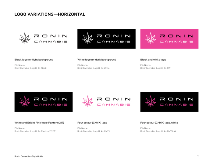
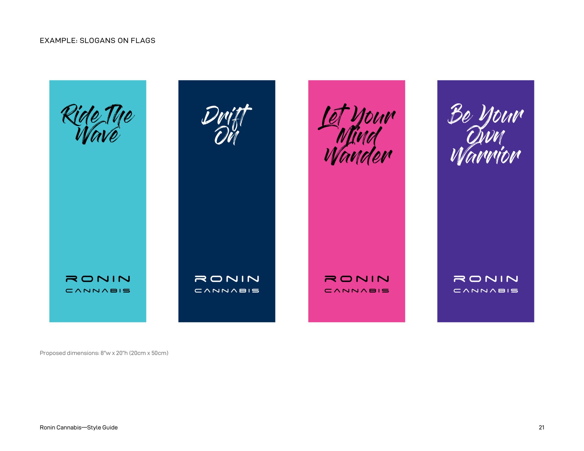
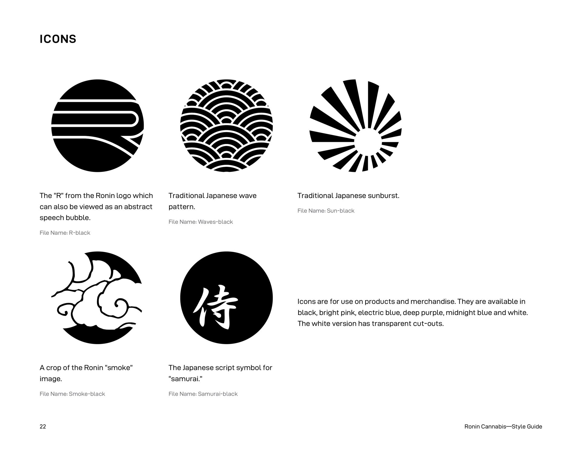
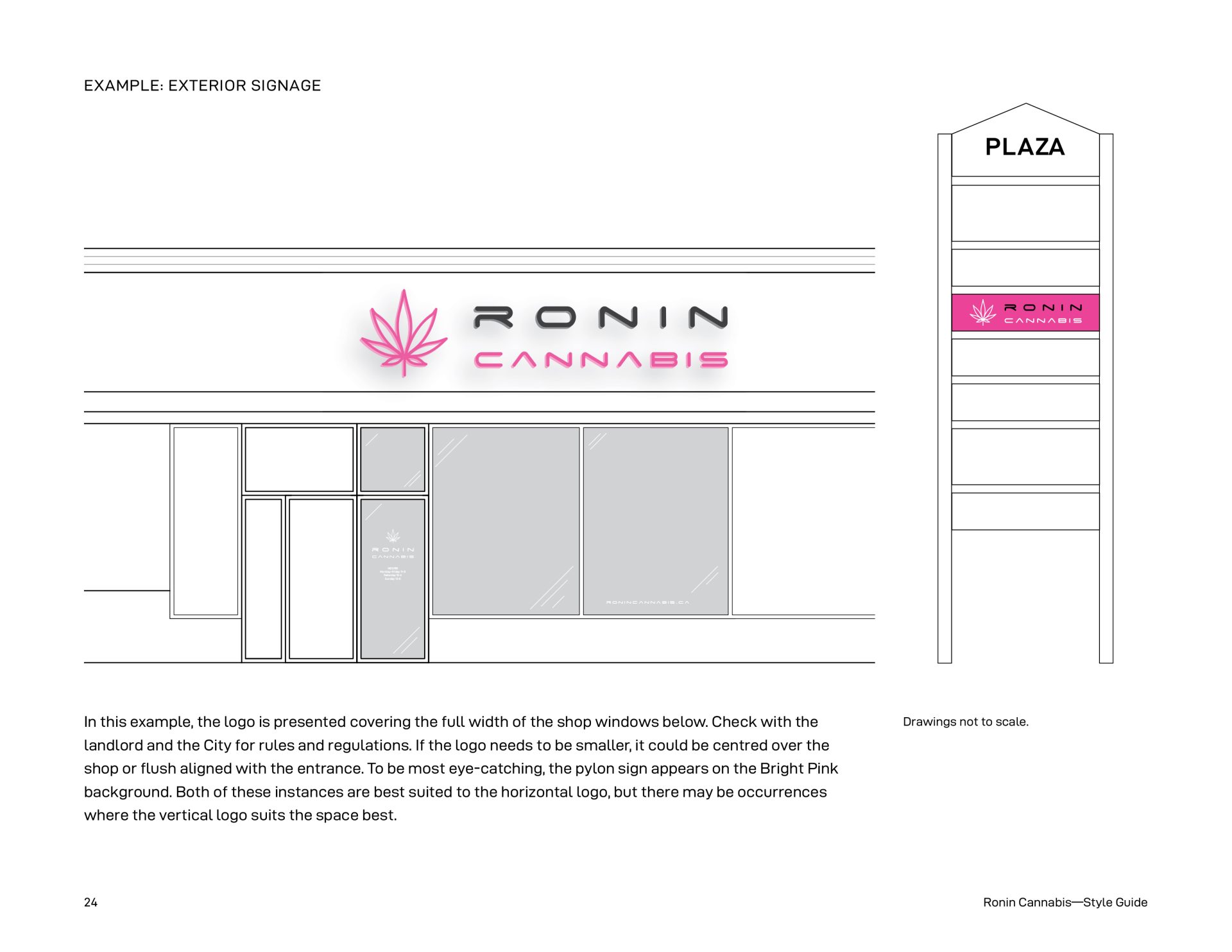
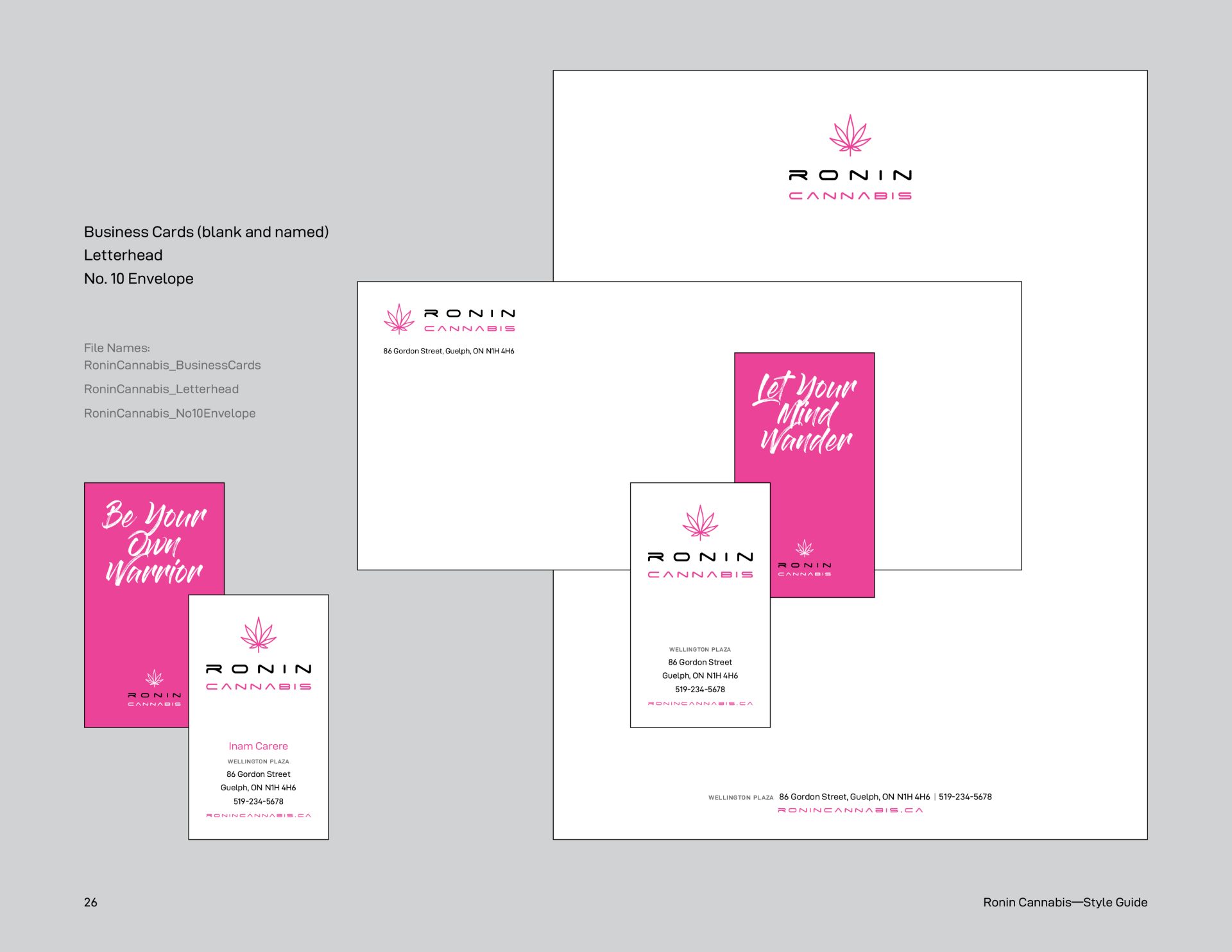
The owners of Ronin Cannabis came to X-Design seeking not just the design of the interior of the store including the overall vision, all finishes, display cases and everything in between, but they also needed their brand identity created which involved researching the name and the story behind it, logo design, colour and font selections, graphic wall artwork, slogans, flags, custom icons, exterior signage and window film, stationery, product description cards, t-shirts, bags, other merchandise and a style guide. The inspiration for the Ronin brand comes from Neo-Tokyo influences—merging traditional Japanese with modern influences. Colours are inspired by narrow alleyways and nighttime street scenes with pink and blue neon signs. Fonts are a mix of futuristic and traditional brush strokes. Named after Japanese warriors, wanderers and drifters, Ronin Cannabis is based in Guelph, Ontario. The design elements of the Guelph location were rolled into a second location in Cambridge, Ontario.

